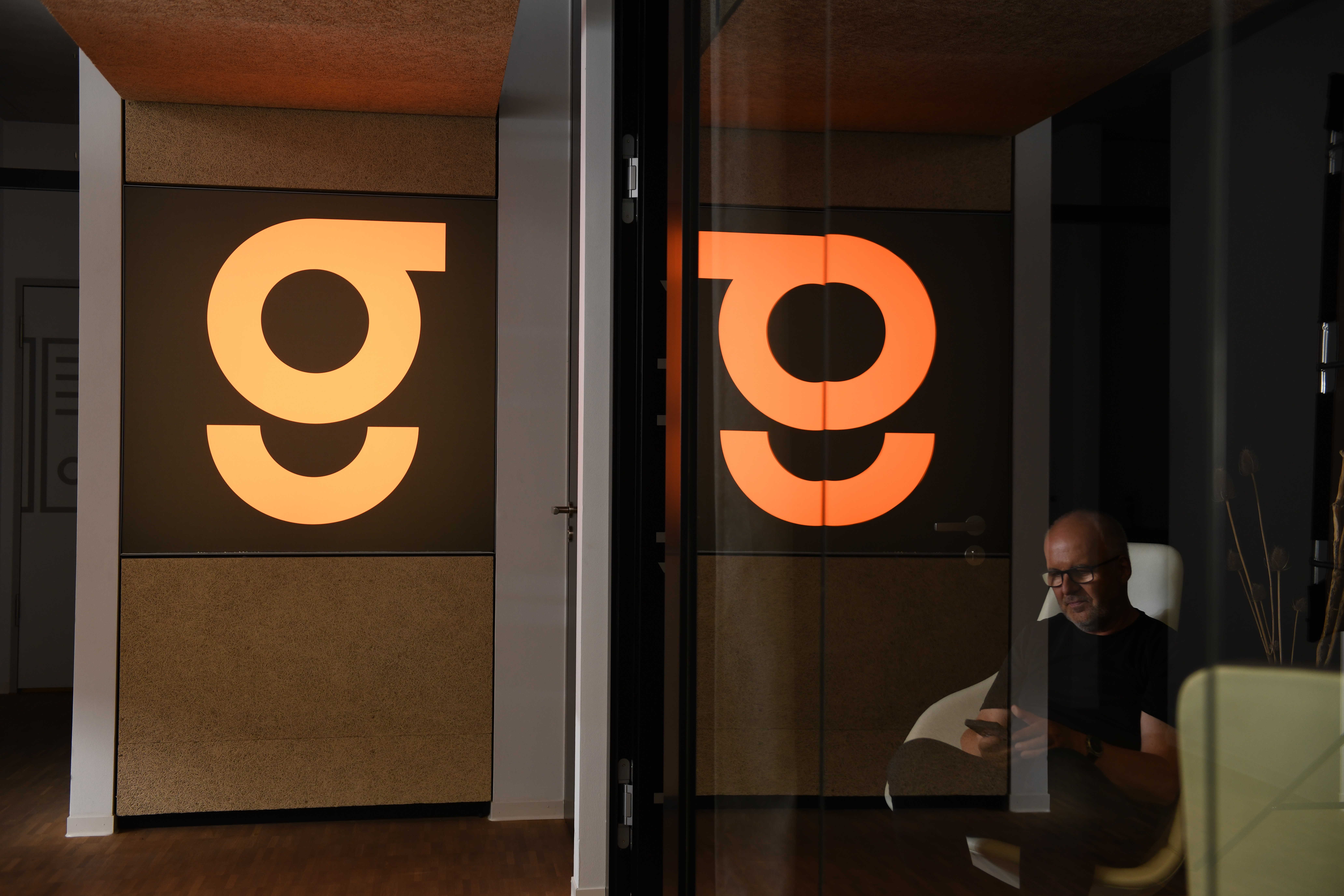
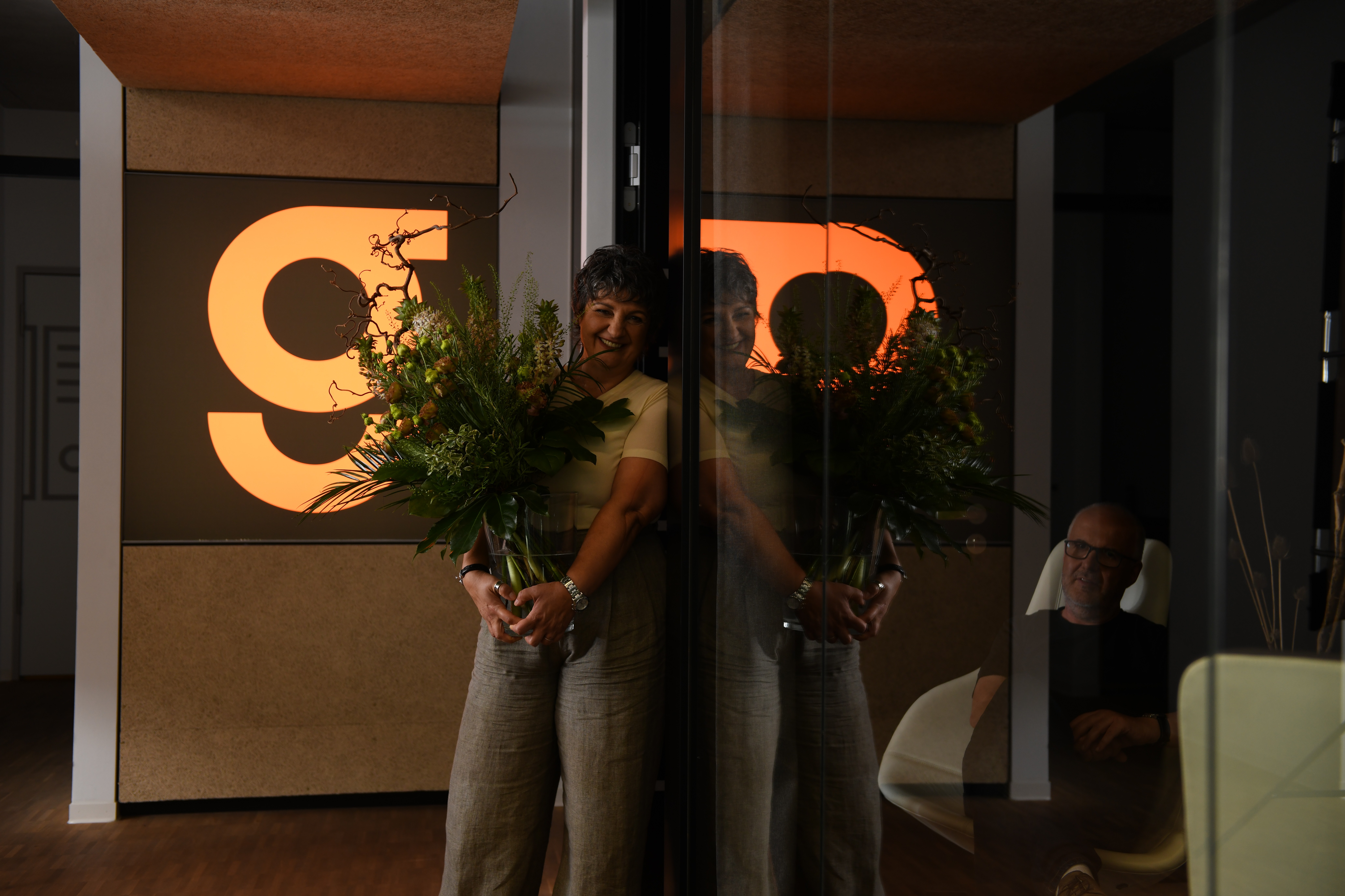
form follows function - our new logo
DATE
october 2025
READING TIME
1 minute
to mark our 30th anniversary, we introduced a new brand mark on 1 october 2025at its centre is the letter 'g'.
the new logo is built on a simple idea: reduce everything to what truly matters and allow the design to emerge naturally from our own work and values.
it begins with one of the most fundamental geometric forms - the circle. simple, precise, and purposeful, it has long been part of the language of our projects.
circles appear throughout our work, particularly in the planning of large-scale medical technology. in radiotherapy, circular systems define entire treatment environments. linear accelerators rely on rotating components whose geometry is driven entirely by function, precision, and performance. yet the circle represents more than technology alone. it also symbolises movement, continuity, and carefully coordinated processes—qualities that reflect the way we approach architecture and design.
the "g" evolves directly from this closed form. a deliberate opening transforms the circle into a distinctive mark that stands confidently on its own while still revealing its origin. every line, radius, and proportion follows a clear and intentional design logic.
the result is a logo that focuses on what is essential rather than adding unnecessary elements. no decoration, no excess—just a clear, functional identity that reflects the principles behind our work. it follows one simple rule: form follows function.
in that sense, the logo reflects the way we work – precise in planning, structured in process, and clear in execution.