our new website
DATE
1st october 2025
READING TIME
3 minutes
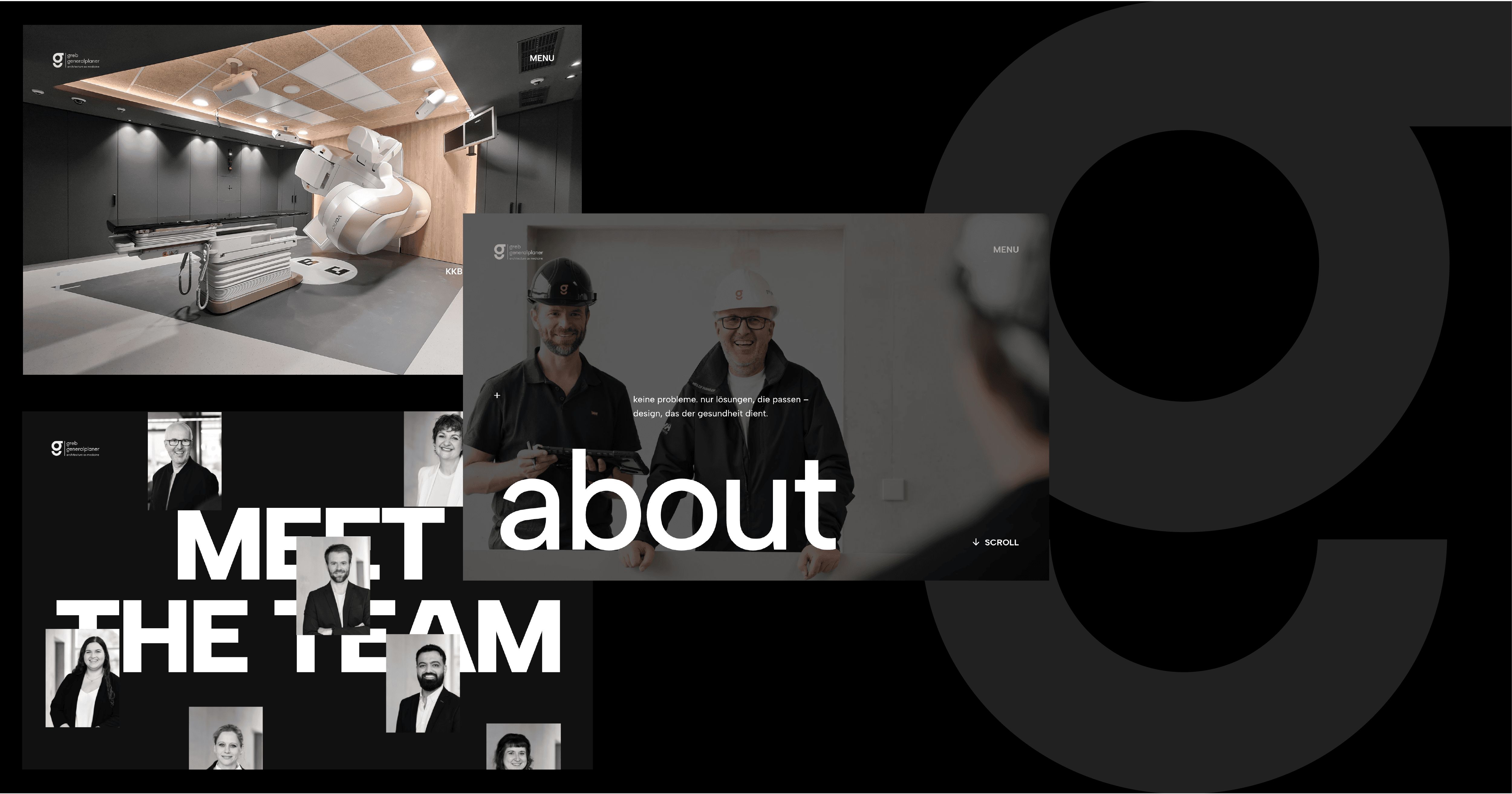
today we are revealing another big secret: our rebranding and our new website are finally here.
for our 30th anniversary, we planned something very special: a rebranding that finally aligns our appearance with the passion and quality that we put into our projects day after day.
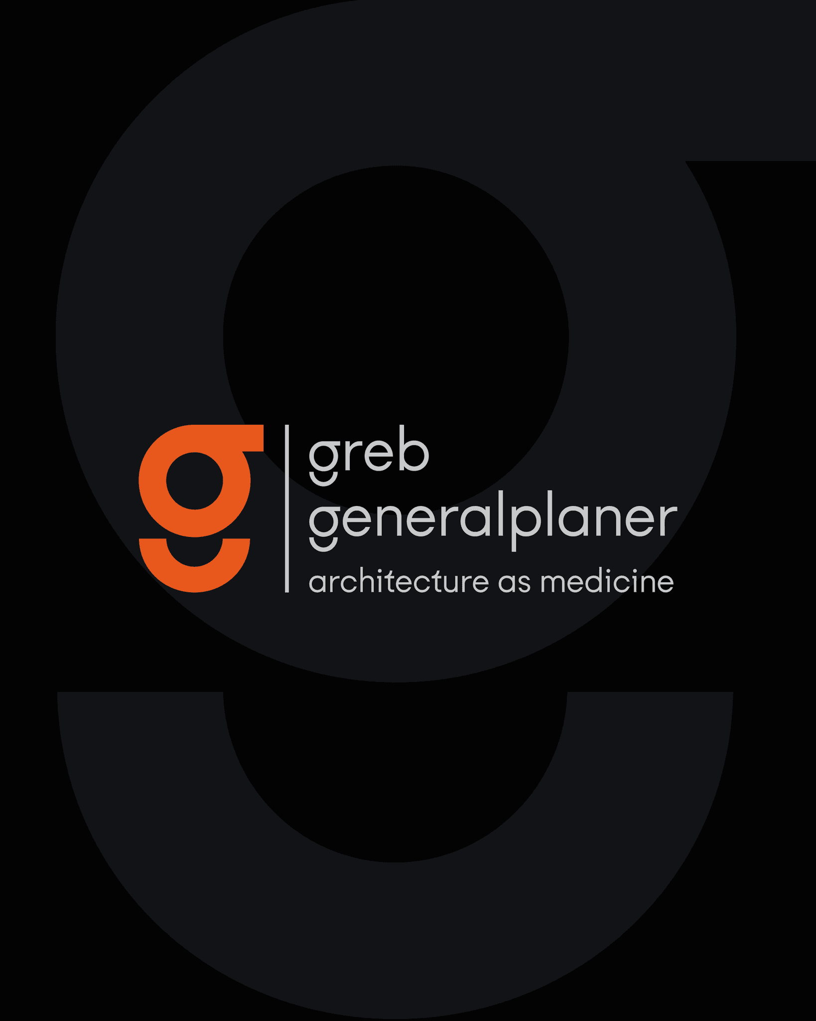
the shape of the "g" is based on large medical devices and the design language of our work - that is why we decided on exactly this typographical style. above all, our vision of healing architecture is important to us because it is meaningful and you can really make a difference with architecture. our claim "architecture as medicine" sums this up perfectly.
the orange tone we chose for our corporate design underscores our drive to rethink projects and find solutions. we do not have standard projects, but rather challenges for which we always develop individual solutions.
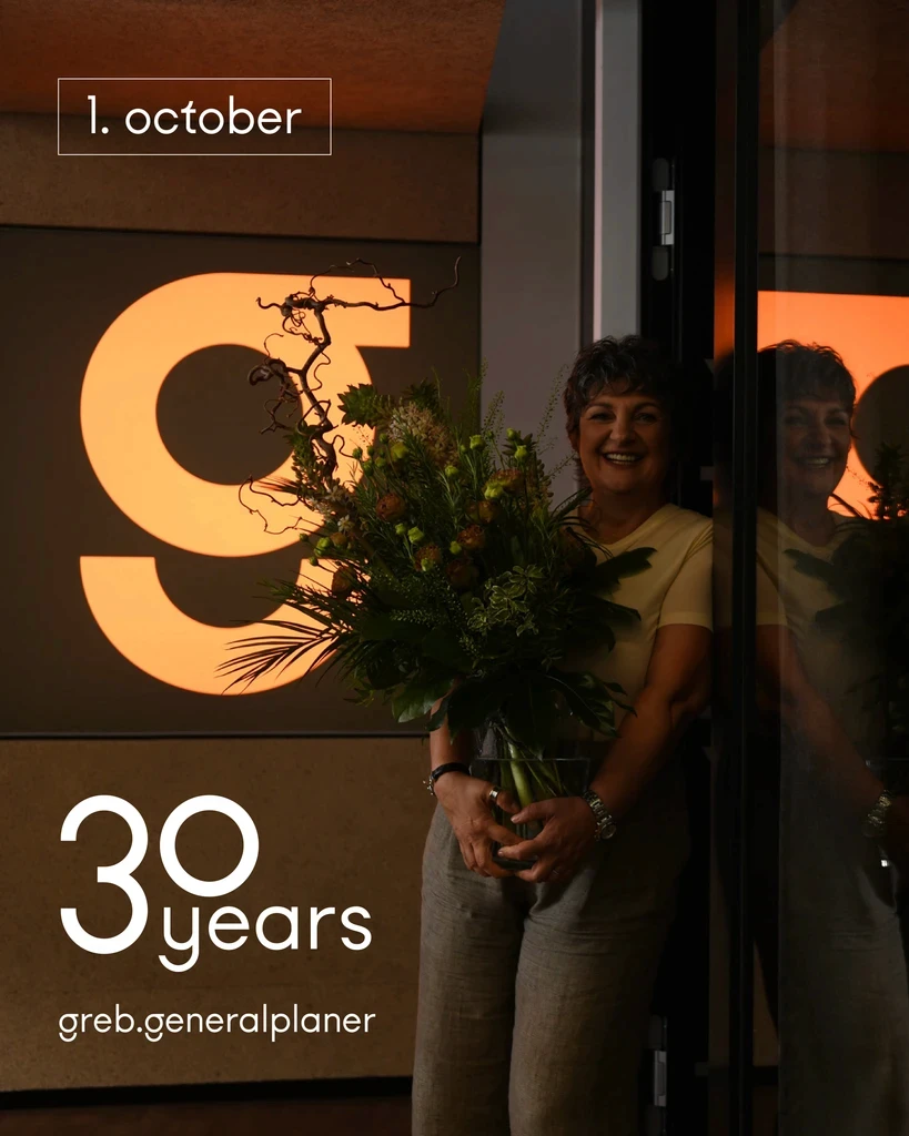
together we are celebrating three decades of greb.generalplaner.